Media Passport
Illustrator Practise

Anette Homework on passports


This is my Holiday Video
Evaluation
Passport cover
.png)
This is my passport pattern

Sands serifs

InDesign Passport


Evaluation
These are the final products of my front, inside my passport, pattern, and back.
The front was made with a purple color and it has a logo which was made with some stars and some dots and made a circle and then I have made 3 more circles with squares
The inside of the passport was made with 2 different colors I went on Indesign and then I added some models to the colors in the back. After that, I added my image and some information about myself, and on the left, I added some writing.
The pattern was made with the twist toll after I had added the 2 different colors.
And finally, the bac I chose the same color was the front of the passport then I added a plane and some writing to go with the plan.
It turned out good the front the inside and the back went good with the pattern but I have to do this the the future I will change the back because I think if I do it again I will add some more things on the back.
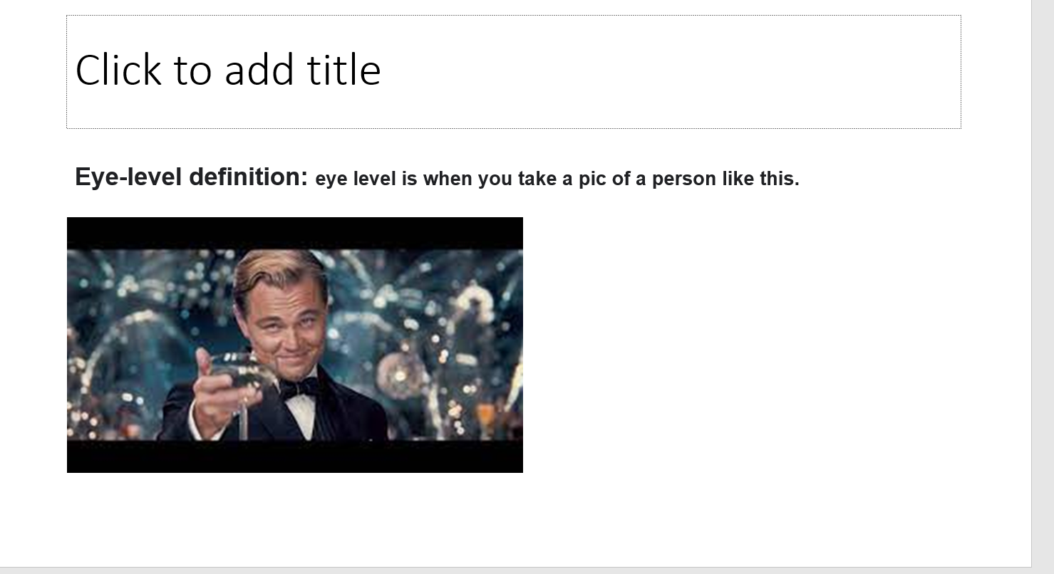
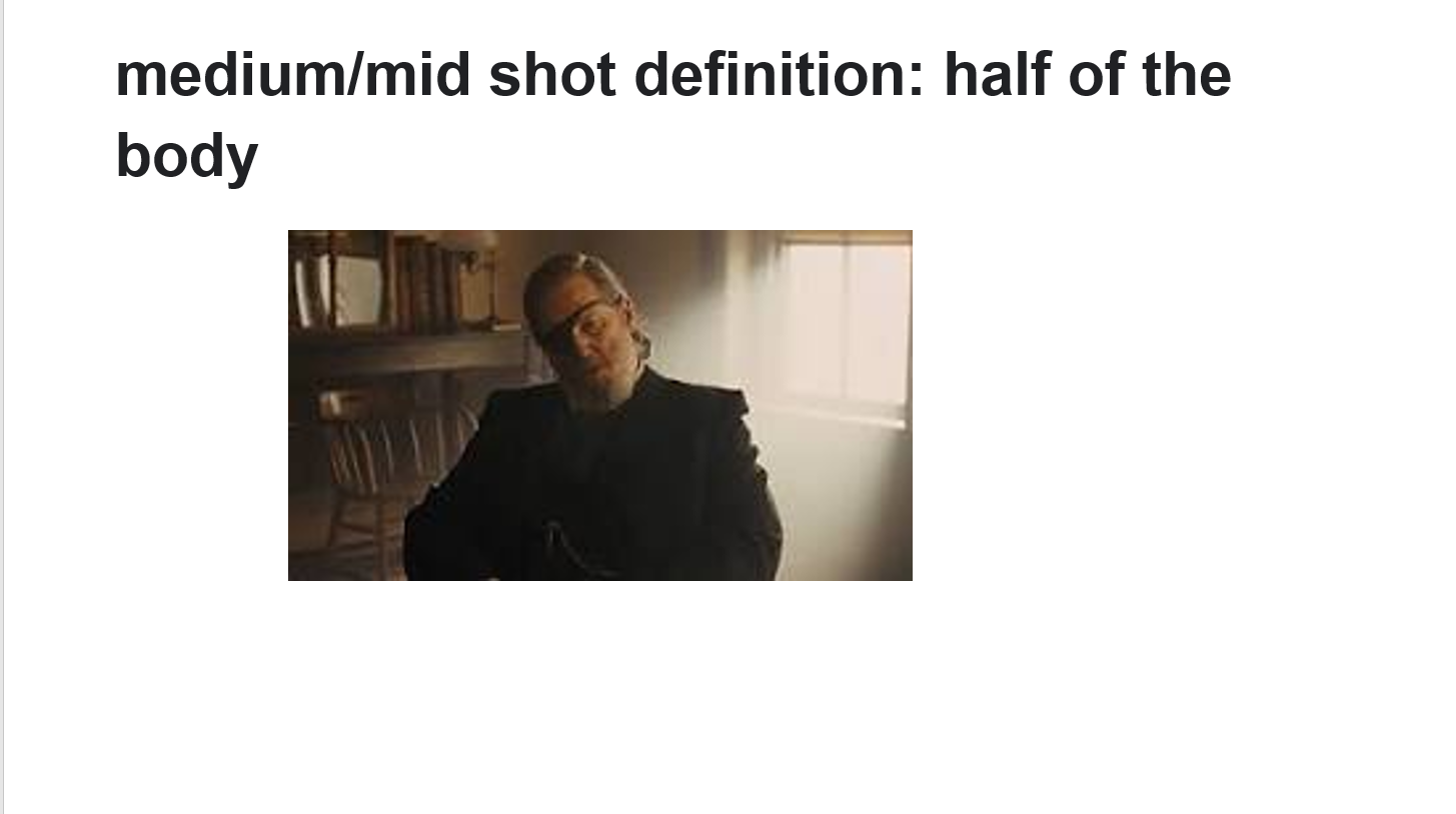
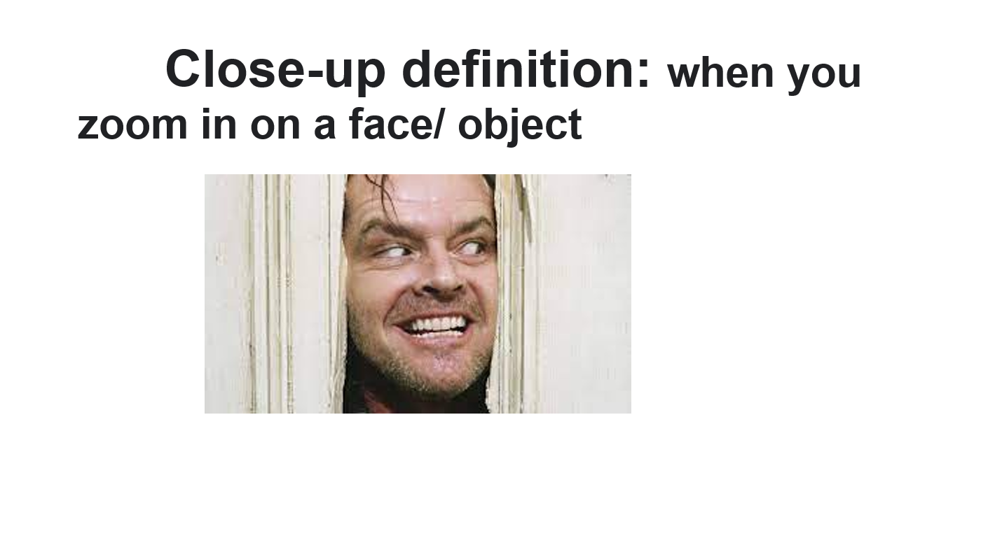
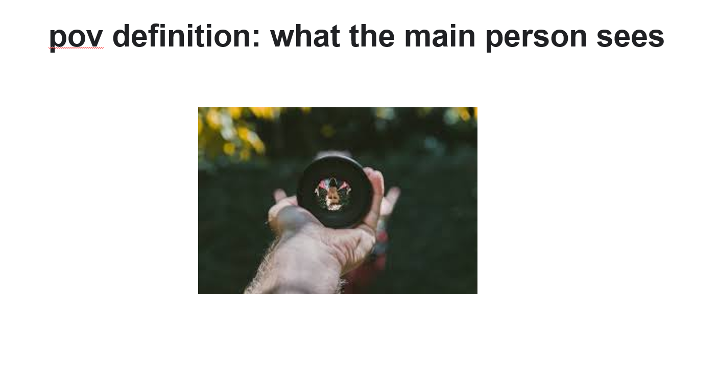
Shot sizes and camera angles


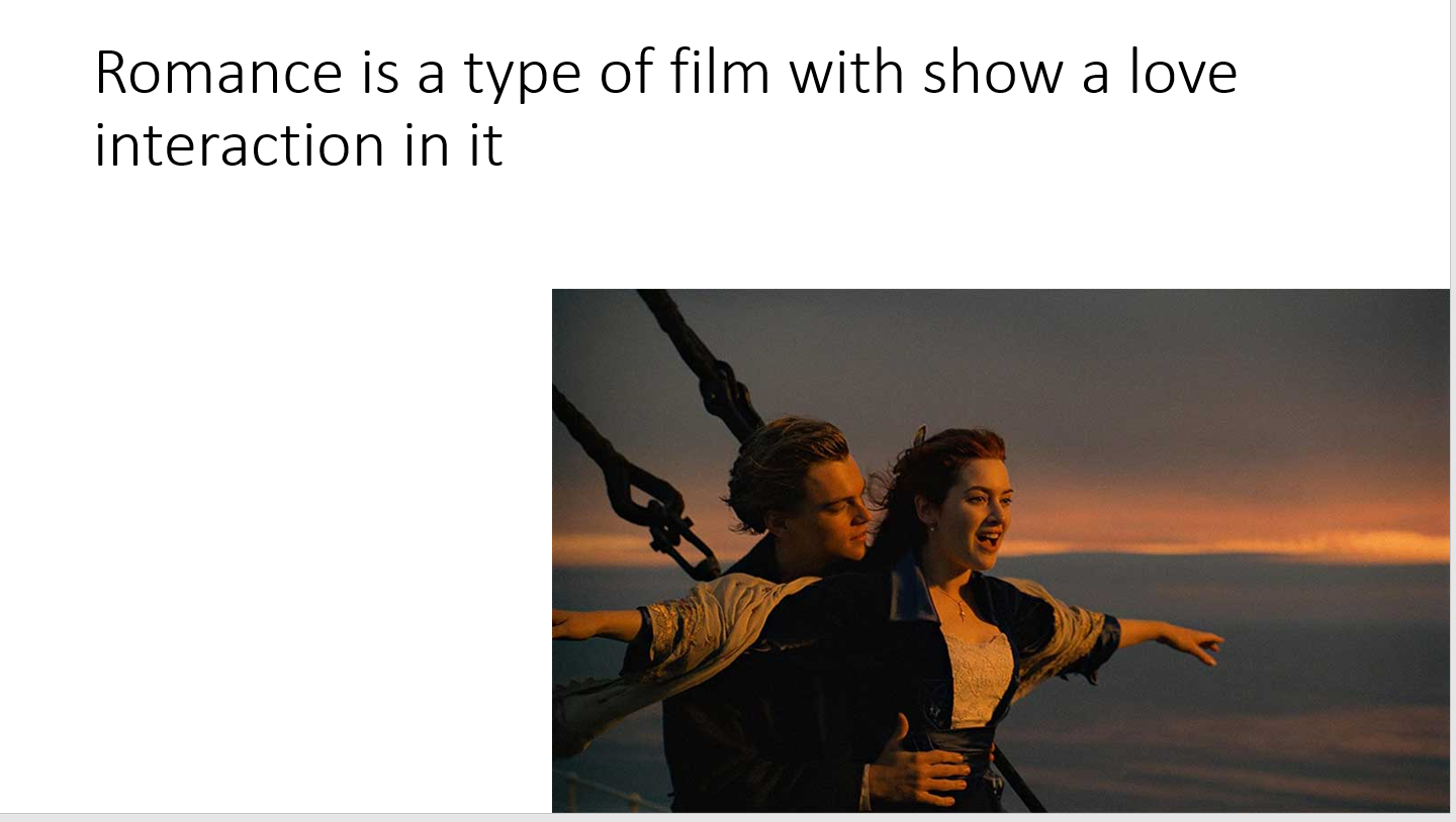
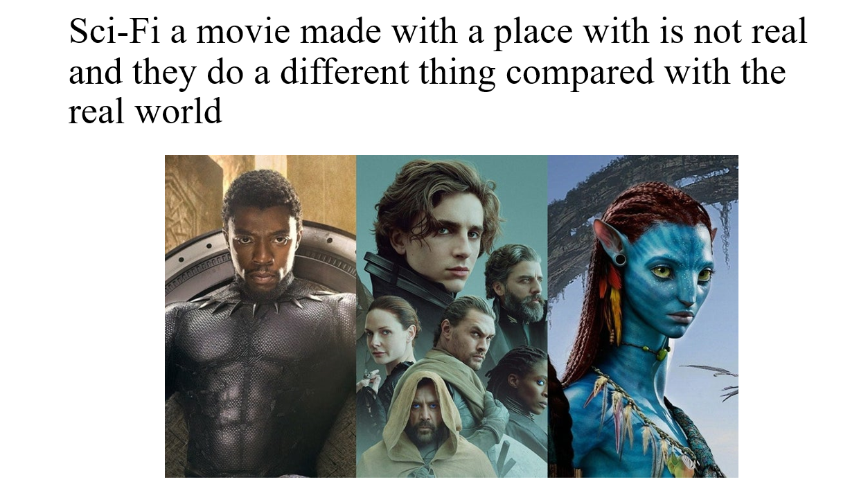
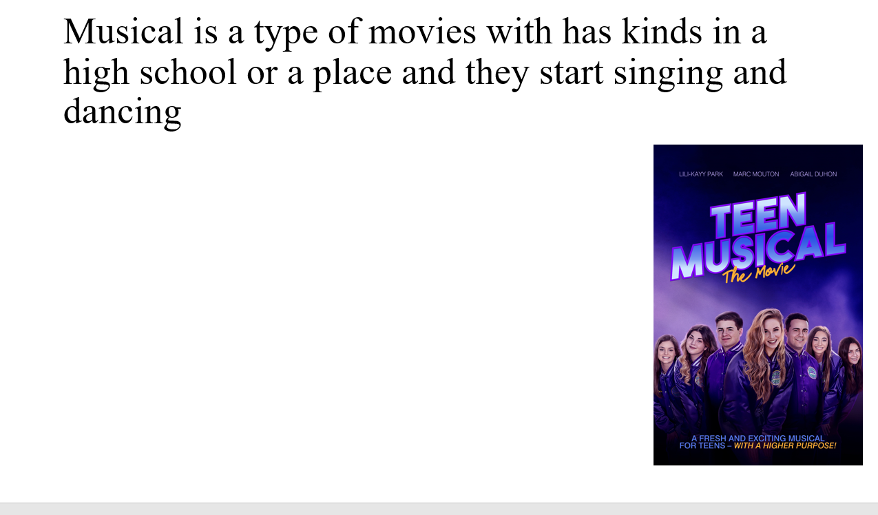
 Movie genre


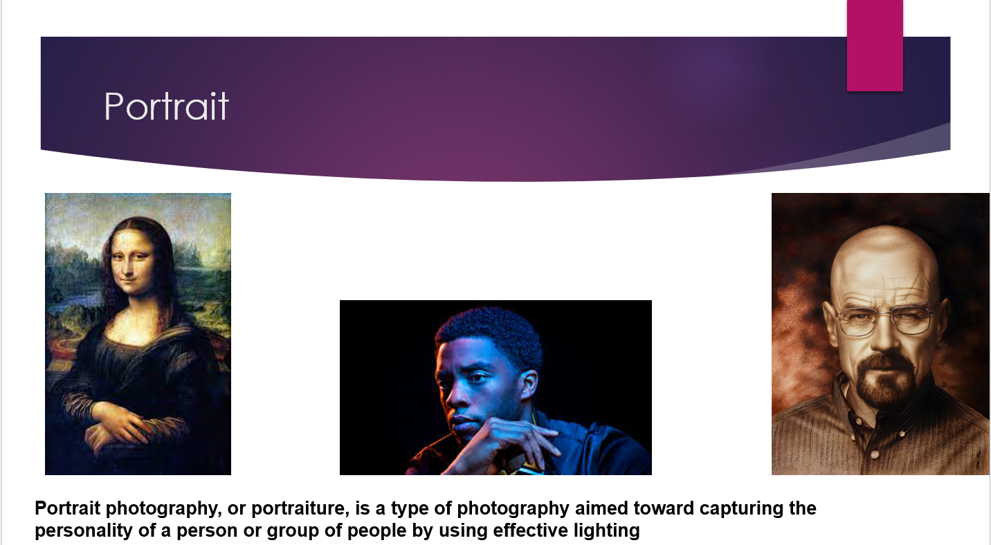
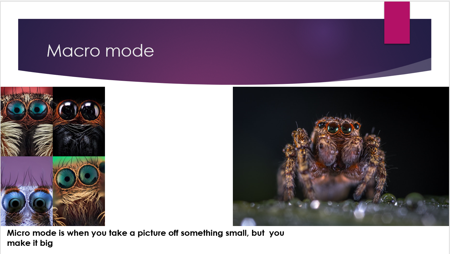
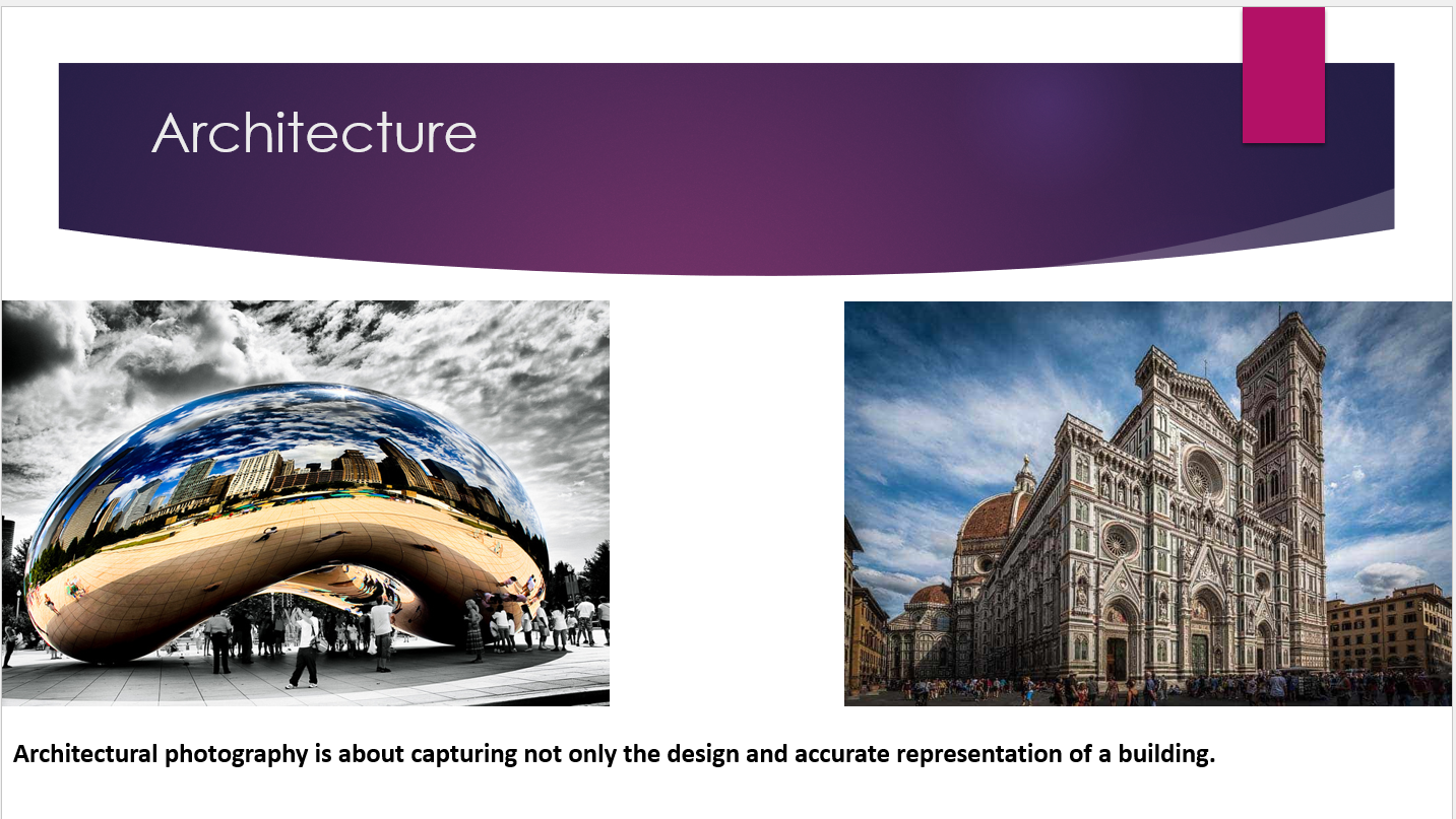
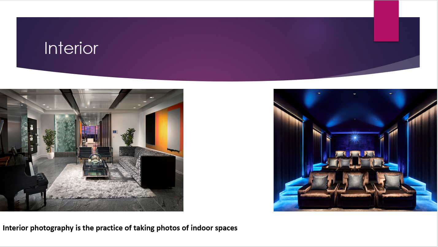
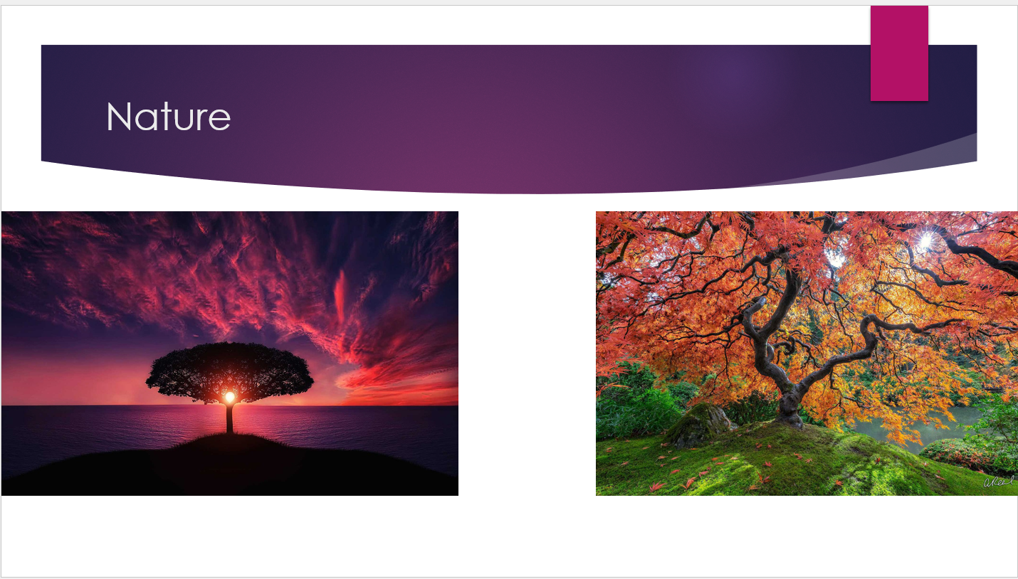
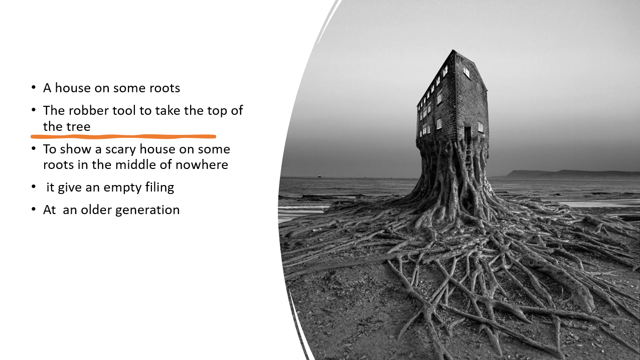
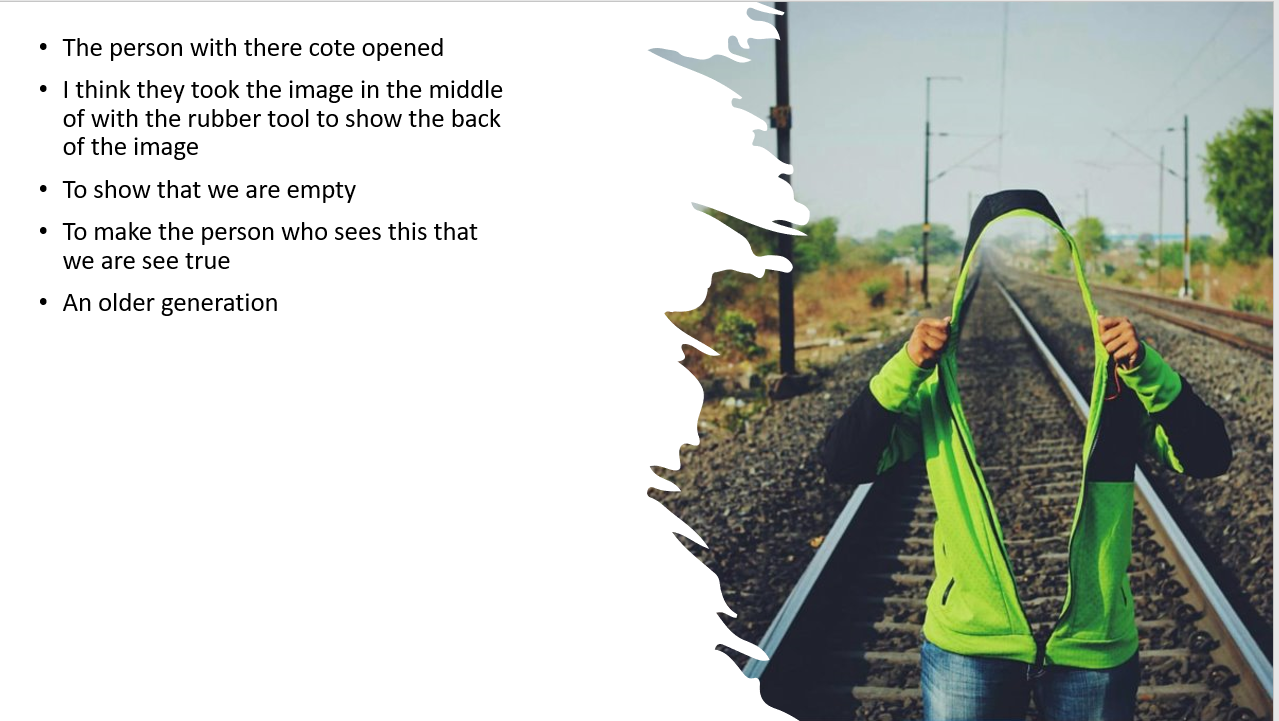
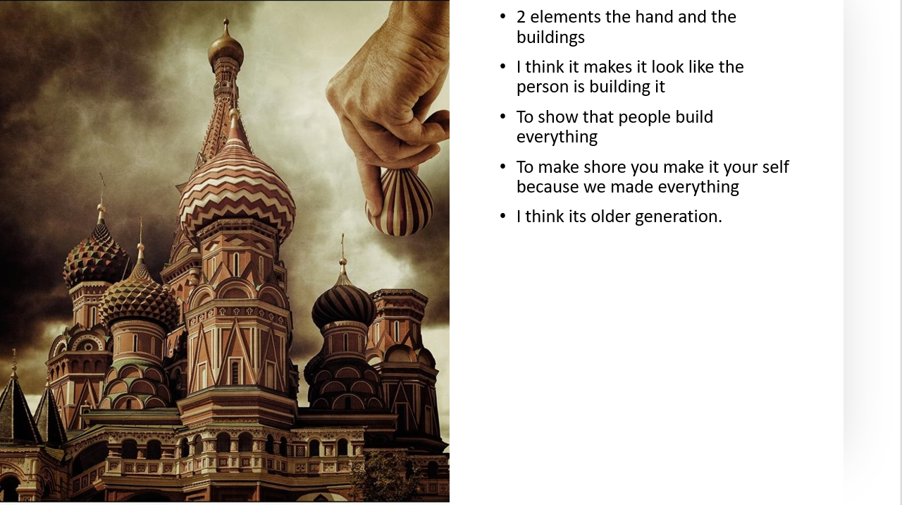
Type of photography


The Natural History Museum


 I went the the museum to take some pictures of animals that interested me with their size and how they used to live their life.the bird last bird I like it because it has the strongest bite in the animal habitat.
Studio photography practice

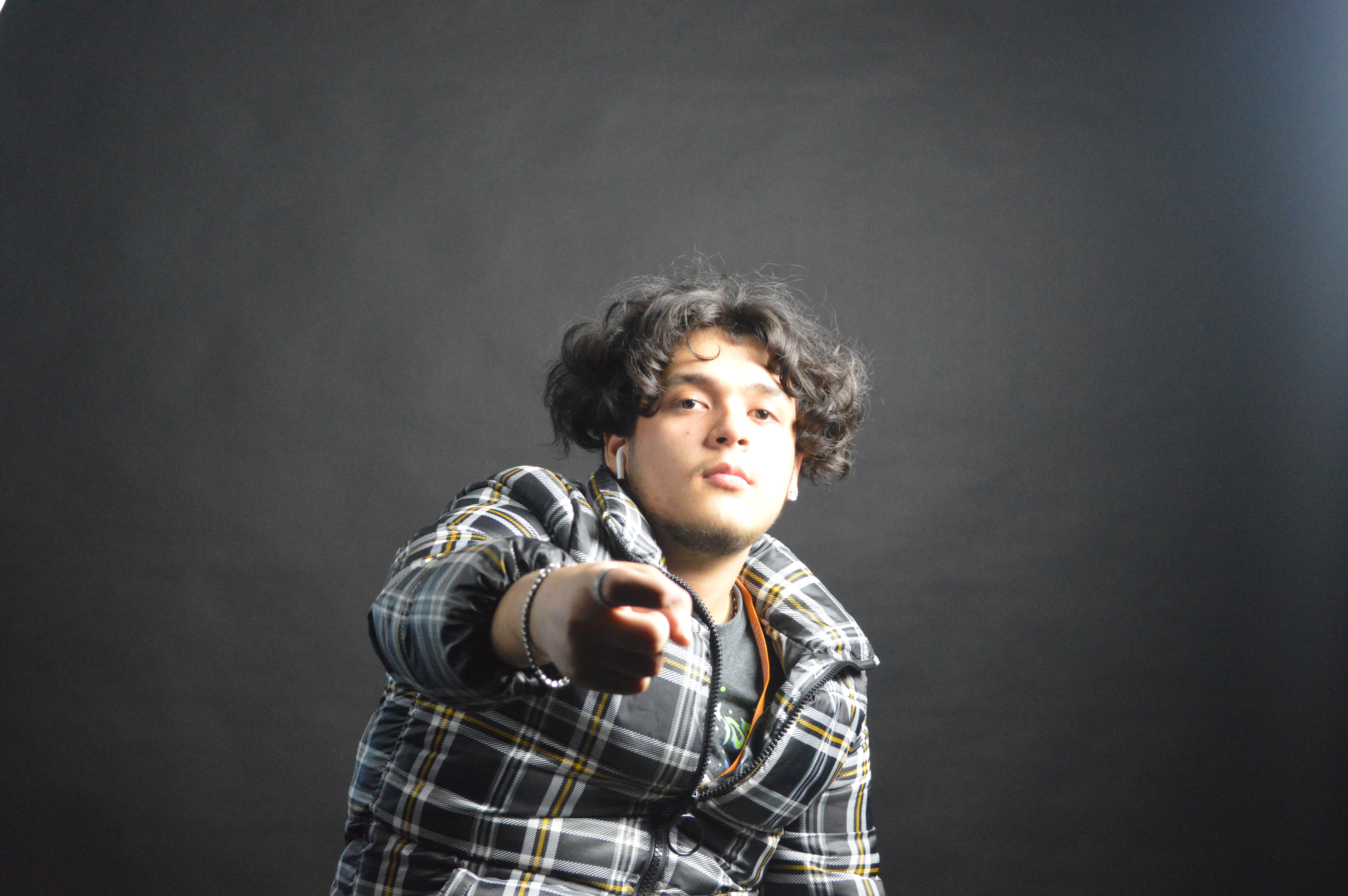
 the lighting was a bit too much because in my picture my left side it too light but other than that the practice has worked well and the picture of Razmin came out well. If I could do it again I would put the light in the corners so that 4 lightings make a square with 2 in the back and 2 in the front.
Fashion Photography


GEORGE HURRELL


This my magazine spread .png)
i have done this in Indesign by making two pages adding three lines on each page then putting the pages together and then I have added a heading then i have added a question I selected the text tool and made texts that were generated by the app then I went on the internet to find an image and found this one and I think it turned out good because the image goes with the text and it likes gives an image of the place the magazine is about.
Evaluation for magazine
This is my magazine. I did this on Adobe InDesign and used two pages and columns. I added a different font for the title and added subheadings, and a question, and for writing I used the 'replace with text' tool.Afterward, I added an image related to the title, and then I put a question under the image to attract attention. In my opinion, it was easy to do and I really enjoyed doing it. If I were to do this in the future, I would add a text with a more attractive font for people.


Type of photography
The Natural History Museum
Studio photography practice

GEORGE HURRELL
.png)
Comments
Post a Comment